2023
Reformer
Website Design
Web Designer
The core idea behind the design was to visually reflect the brand's focus on balance, strength, and mindfulness.
The website needed to evoke calmness and trust, while also making the booking process simple and intuitive for new and existing clients.
I focused on:
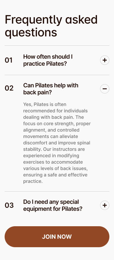
- Clear information hierarchy
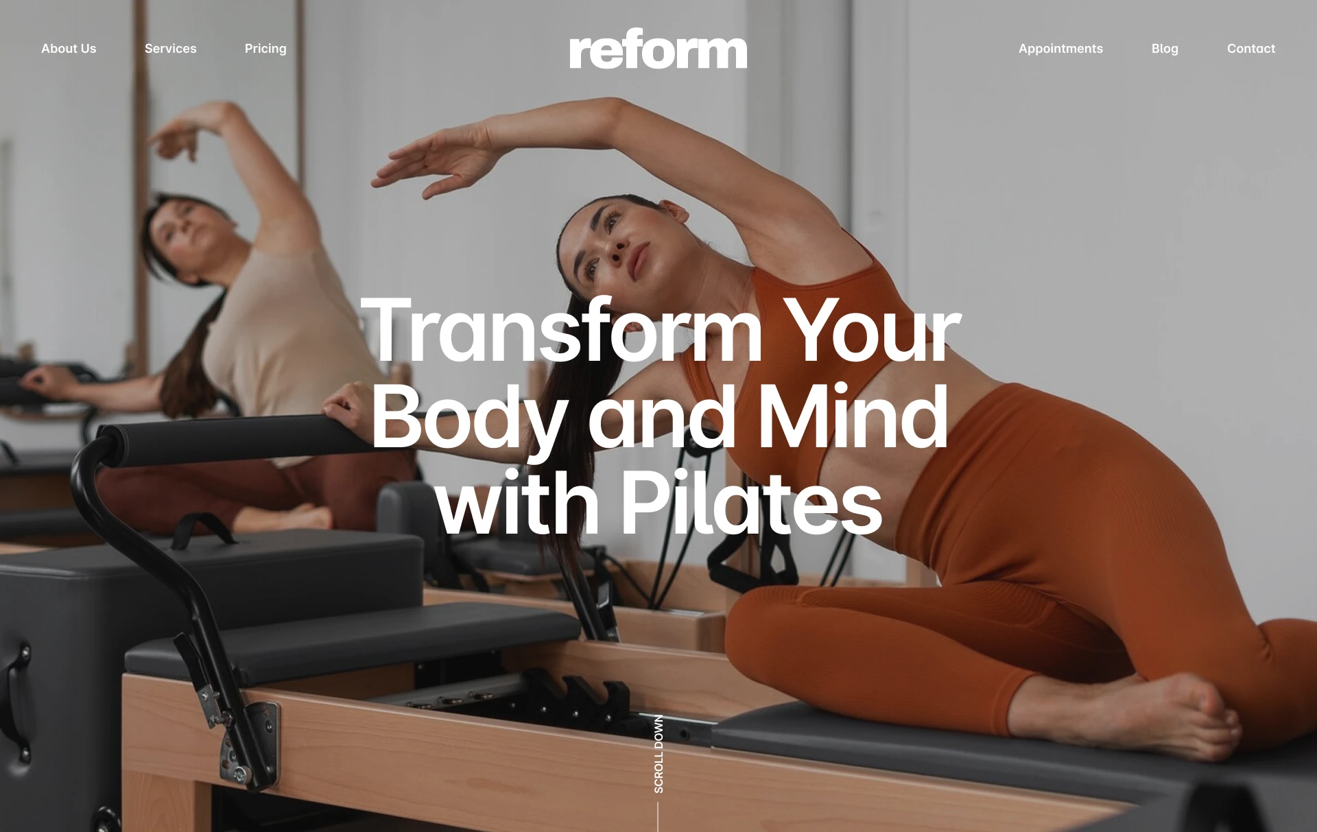
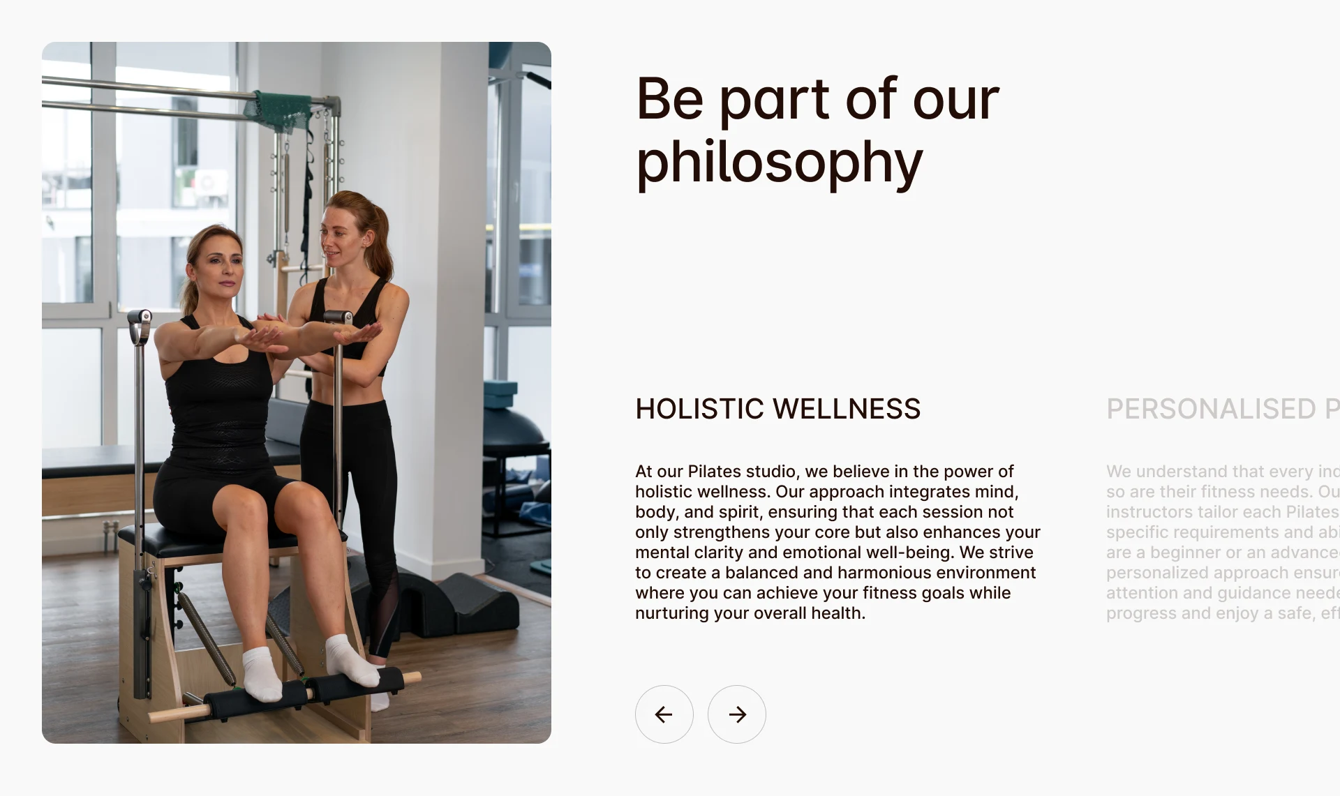
- Human-centered imagery
- Gentle but structured visual language
- Easy conversion paths
The primary audience for the Reformer Pilates website includes health-conscious individuals—mostly women aged 25 to 50—who are seeking a structured, mindful approach to fitness.
These users value well-being, aesthetic environments, and professional instruction.
Many are new to Reformer Pilates and need clear guidance, while others are loyal clients who want a smooth experience when booking sessions or exploring new programs.
The website needed to address both: inspire trust and professionalism for first-timers, and offer simplicity and speed for returning members.
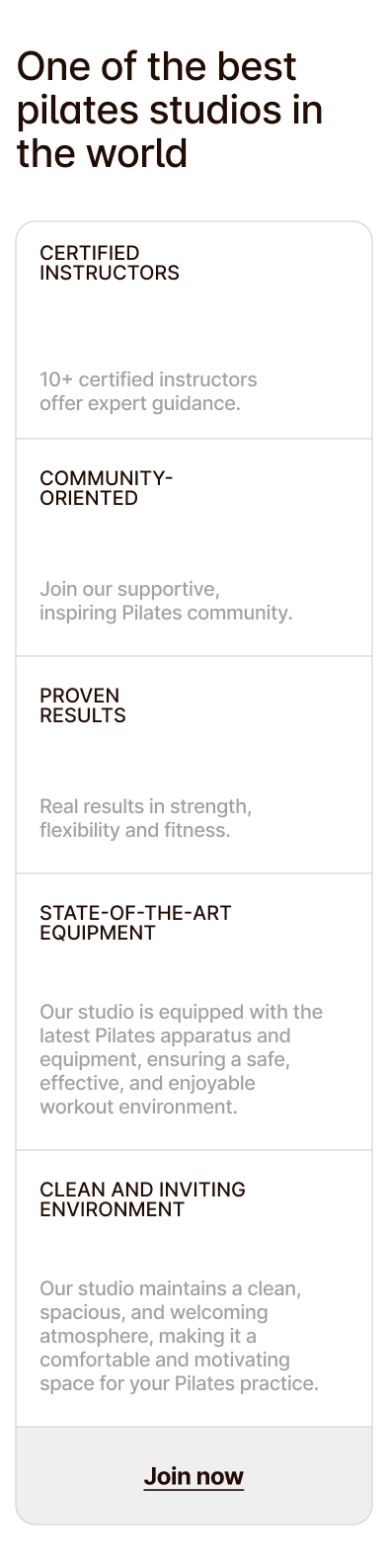
Users prioritize trust, professionalism, and instructor certification when choosing a studio
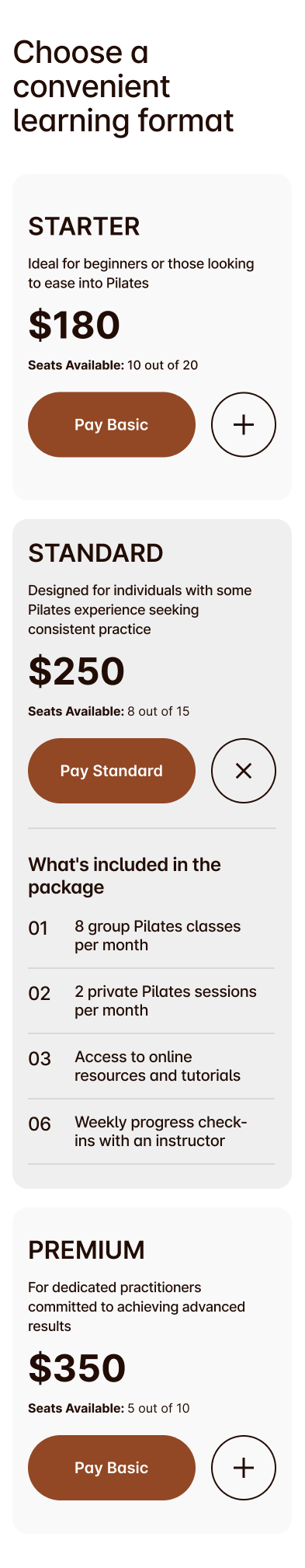
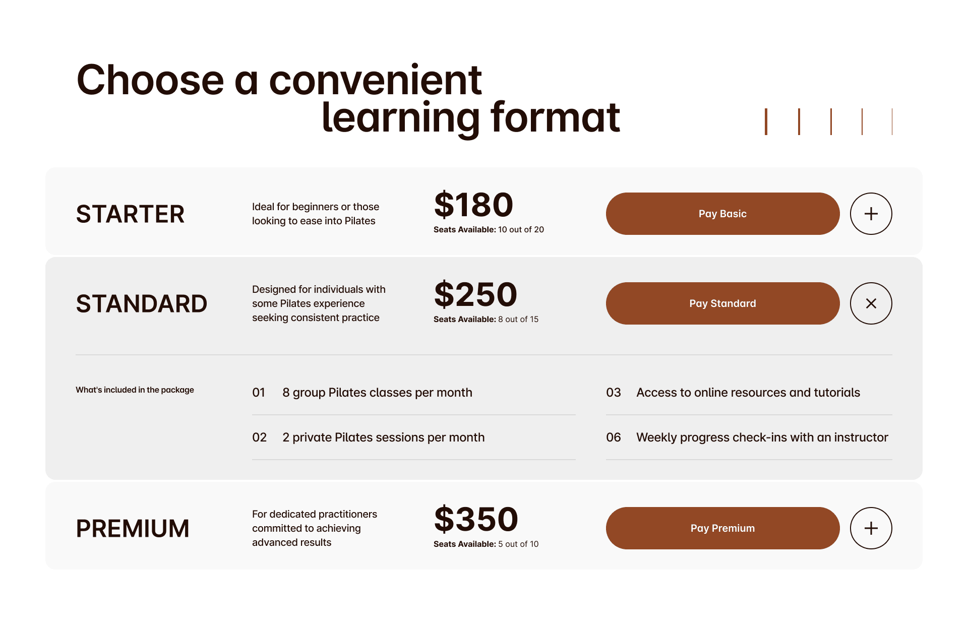
Clear pricing and transparent membership options build confidence and reduce hesitation
Mobile-first design is critical, as a large portion of visitors browse on their phones
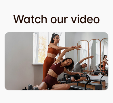
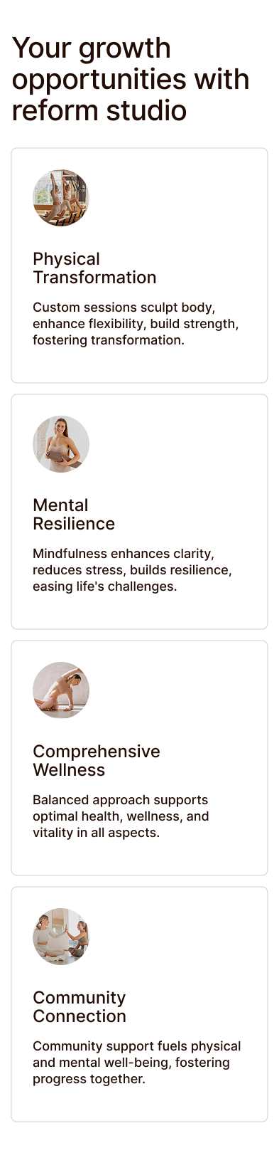
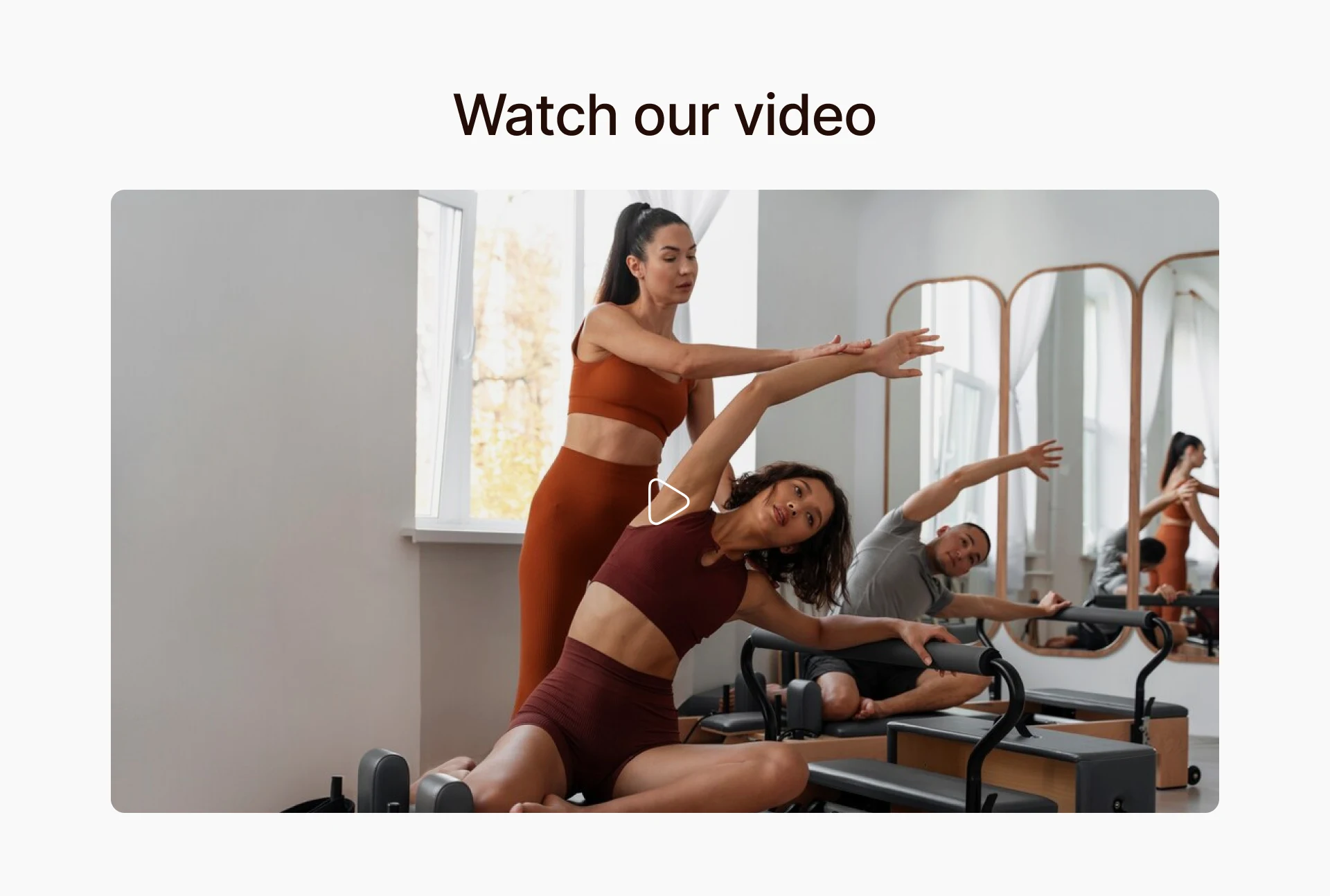
Real imagery of people practicing Pilates increases emotional connection and authenticity
Quick access to booking and scheduling reduces drop-off and encourages action
Testimonials and success stories help convert hesitant users into paying clients
I analyzed top Pilates and wellness websites and found many lacked clarity, emotional connection, or modern UX.
Some felt luxurious but were hard to navigate, while others were too minimal and failed to convey value.
This gave Reformer a clear edge—to stand out with a clean, engaging, and conversion-focused design that combines professionalism with warmth.
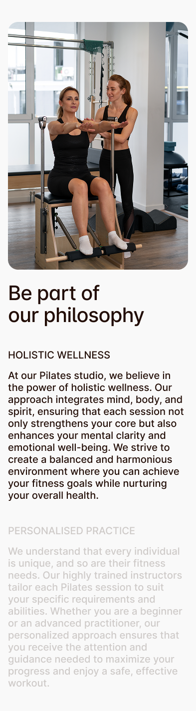
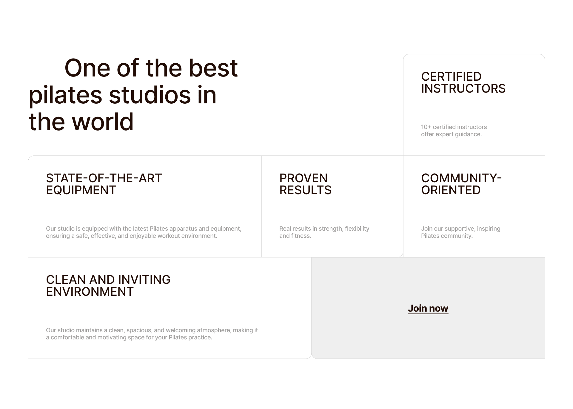
I crafted a clean, intuitive system that reflects the calm and balance of Pilates. Soft neutral colors, modern typography, real studio imagery, and modular layouts ensure a seamless user experience across devices. Each UI element - from buttons to cards - was designed to feel welcoming, light, and professional.
Reformer’s brand reflects the core values of Pilates—balance, clarity, and calm.
The tone of voice is warm and supportive, making users feel welcome and informed without overwhelming them.
Language is clear and approachable, guiding users gently toward action.
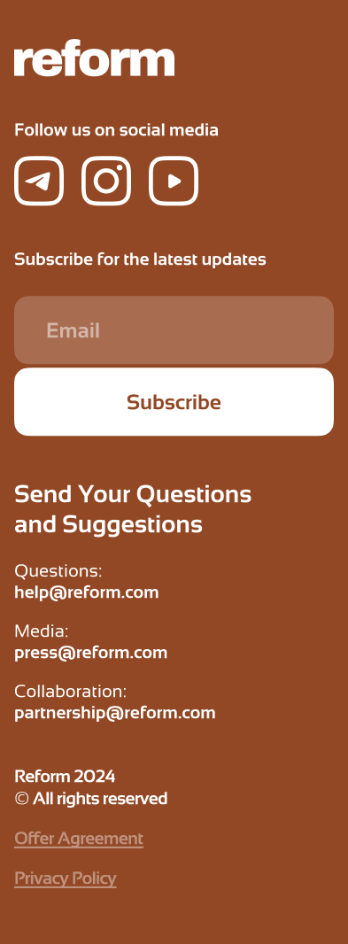
Visually, the brand uses soft neutral tones, modern typography, and real imagery to convey trust and authenticity.
Clean layouts, generous white space, and smooth interactions create a sense of ease.
The overall experience is minimal yet intentional—designed to feel like a digital extension of a serene studio session.
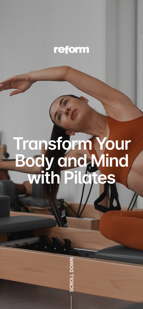

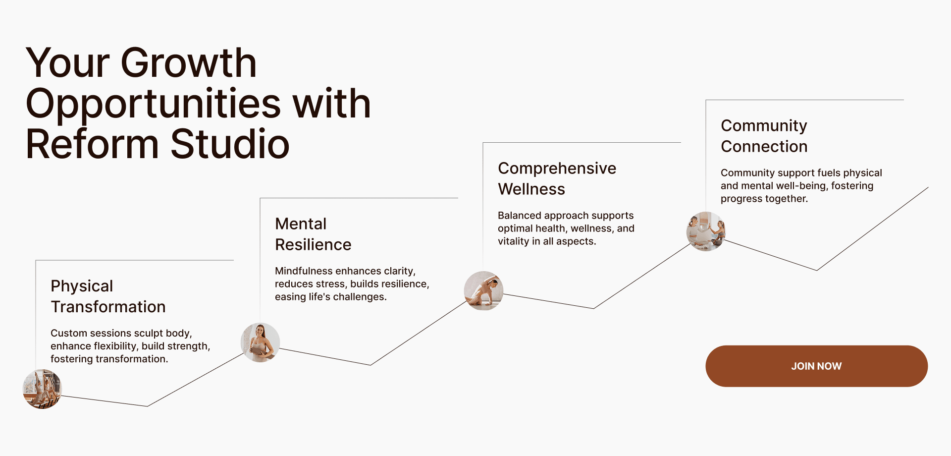
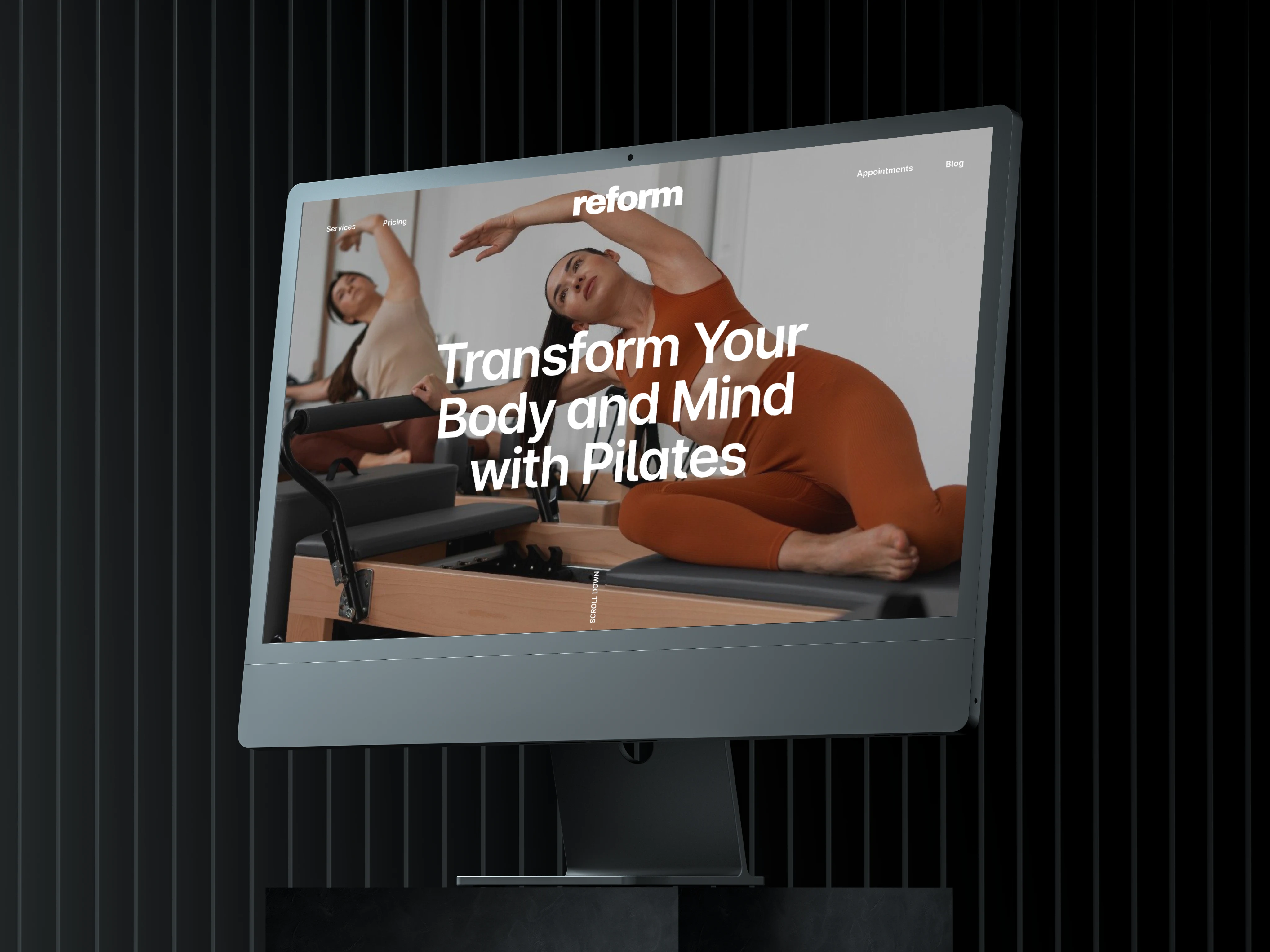
The Reformer Website will be a clean, modern platform showcasing the benefits of Pilates reformer exercises. It aims to engage fitness enthusiasts by offering easy access to class info, instructor profiles, and booking options, encouraging users to join or sign up.
I started by identifying core user needs: learning about reformer Pilates, exploring classes, meeting instructors, and booking easily. Inspired by top wellness and Pilates sites, I focused on clear navigation and a calming aesthetic.
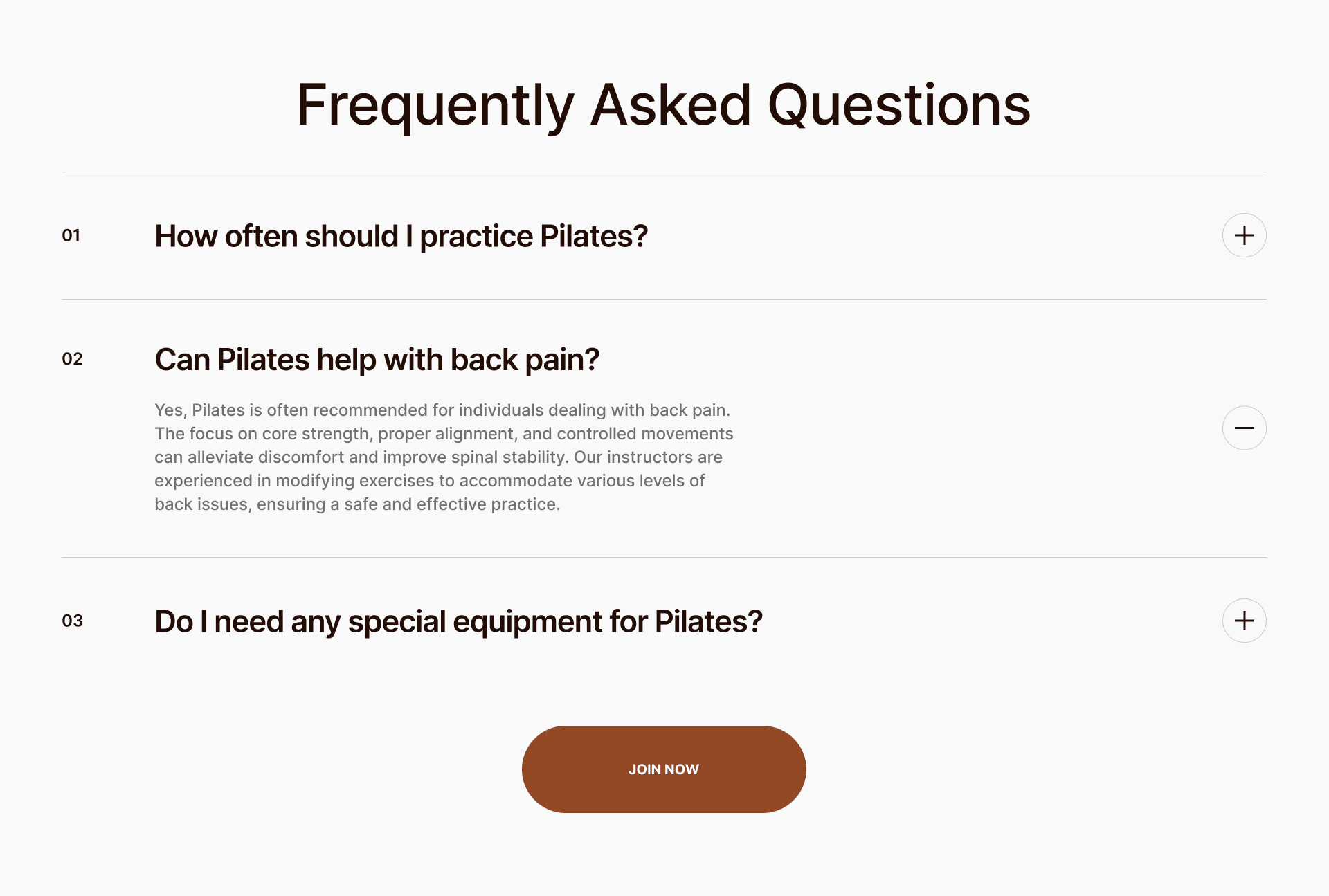
Key features included class schedules with booking, instructor profiles, testimonials, membership plans, and educational content.
The design concept emphasized balance and clarity with soft colors and clean typography to reflect the studio’s wellness values.
I mapped the user journey and page structure through early sketches, starting with a homepage hero that highlights the studio’s philosophy and calls to action.
Wireframes were created for class listings with filters, instructor pages, membership details, and a blog for ongoing engagement.
Mobile wireframes prioritized simple menus and collapsible sections for ease of use.
These helped clarify layout, functionality, and content priorities before moving into visual design.
After sharing wireframes with stakeholders and potential users, I gathered feedback on clarity, usability, and emotional tone.
Adjustments were made to simplify navigation, improve CTA visibility, and better match user expectations for content hierarchy. Interactive prototypes supported usability testing, revealing friction points that were addressed before finalizing the design.
This iterative process ensured the final design is both beautiful and user-friendly.
The website design delivers a calm, user-friendly experience that aligns perfectly with the Reformer Pilates brand values.
It simplifies the booking process with clear calls to action and intuitive navigation, making it easy for new and returning clients to find classes, instructors, and membership options.
The flexible layout adapts seamlessly across devices, prioritizing mobile users without sacrificing visual appeal.
Thoughtful use of authentic imagery and a soft color palette creates an inviting atmosphere that builds trust and encourages engagement. This solution balances aesthetics with functionality to support the studio’s growth and client retention.
.webp)